
An Updated History of Ottawa Senators Jerseys
When walking around the concourse of Canadian Tire Centre, it is immediately apparent that the Ottawa Senators have a diverse jersey history. From the simplistic Karlsson Heritage #65 to the time bending Zack Smith on a red Senagoth #15 because it was a Heatley jersey, and even to the hilarious white 2D with Leafs Suck #69 on it, it can be almost impossible to pick a favourite. Let's check out some of these things.
Not Real Jersey
 When the Bring Back the Senators campaign was going on, this inverted New Jersey Devils 2017 looking jersey was introduced. Management clearly wanted the “Washington Capitals logo except what if Ottawa?” look here. The NHL decided that this logo was too boring of a logo for a professional sports team so it was never actually worn in a game. Shoutout to the early Senators for selling Giant Tiger looking jerseys to unsuspecting fans before making an abrupt switch to an ancient Roman gladiator theme.
Gladiator 1.0 (1992-1995)
Gladiator 2.0 (1995-1997)

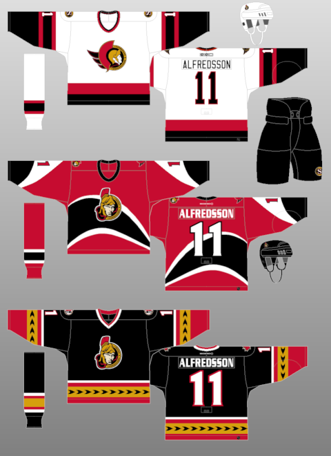
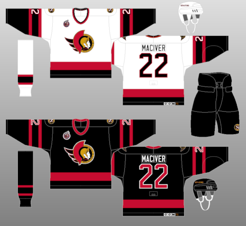
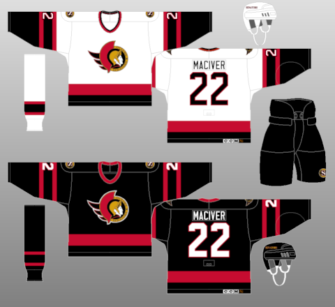
SENS (2008-2011)
Heritage 2.0 (2014)

(most of the images from nhljerseys.com)
The Senators unveiled a theme that didn’t really make a whole lot of sense but produced some really nice unilingual jerseys. Turns out people who bought the Bring Back The Senators jersey realized their jerseys were not actual Sens jerseys and got angry. ’’It was a scam,'' said Dean Vasilas, 25, who has Senators season tickets. ''We're being used. We're proud we got the team, and every time we turn around they always get more money out of our pockets.’’ Ottawa Citizen, May 18, 1991) Dean’s powerful message against mass consumerism resonates with working people to this day. Many thought that the logo looked like a US college football while others thought it looked like the Trojan condoms logo (nice). The jersey was slightly altered after one season by changing the numbers from red with white trim to white with red trim.
The first kinda significant jersey change happened in 1995 when the striping on the road jerseys got some white infusion. Notable players who have used this jersey are melon Jofa Alfredsson, playoff Duchesne (1.0), and NAC Yashin.
Senagoth Phase 1 (1997-2000)
After Rod Bryden’s kid played around on Microsoft Paint for Windows 95, the Sens introduced this weird abstract jersey. This should’ve been filed with the Islanders’ fish sticks jerseys, the Pittsburgh “Rangers” jersey, and the Canucks’ gradient jersey as some of the worst 90s/2000s designs. The team also subtly changed the unilingual “Ottawa Senators” on the 2D logo to the multilingual laurel leaves. In 1999/00, the team got rid of the black 2D jersey in favour of the jersey that features graphable curves.

Senagoth Phase 2 (2000-2007)
Things get even wilder for the Sens as they introduce Ottawa’s first bike sharrows encouraging cyclists to take the full lane on both the arms and waist of these jerseys. This set was used all the way up until the Reebok Edge program took over. While this jersey set really strays far from God’s plan for all of us, it is associated with some of the most successful times for the organization. Despite this success, my favourite moment involving the black arrow jersey is Denis Hamel getting absolutely tossed by Phaneuf.
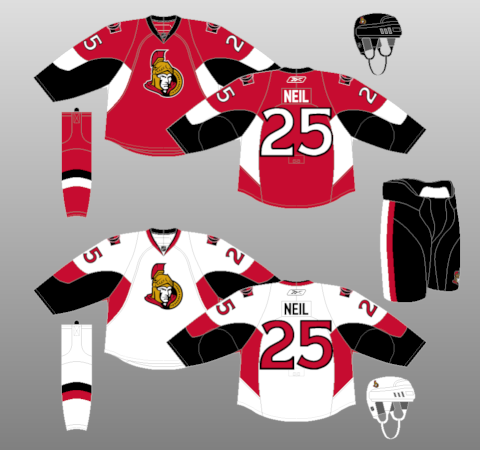
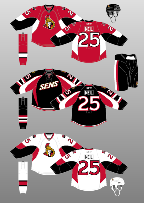
Reebok Edge (2007-2008)
The early 2000s jersey set was updated in 2007 after the Reebok Edge jersey program was implemented. Like the current Adidas situation in 2017, third jerseys were deemed illegal prior to the 2007 season. I remember these being unveiled right after the Cup final run and something like 14,000 people went to CTC to check these out. The centurion head got updated to look more like Chris Neil and then was slapped on a template that was shared with the Pittsburgh Penguins. This logo looks like he could toss hands while the old logo looked like he could only toss feelings. The highlight of the 2007/08 season is probably the infamous Sens Gladiator. The off ice issues were also cool.
Every joke about this jersey has already been made but did you know that Binghamton used this template for both of their jerseys up until last year? Matt Duchene scored against Pascal Leclaire in this jersey (check out those empty seats @ attendance Twitter).
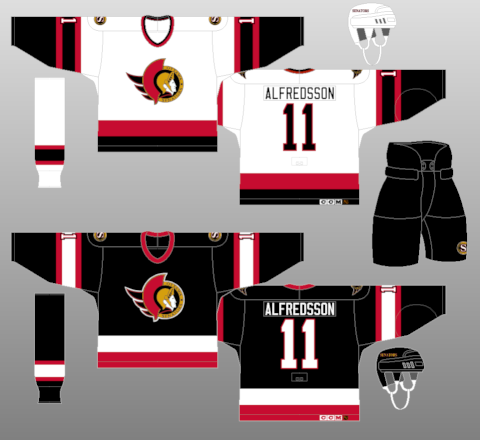
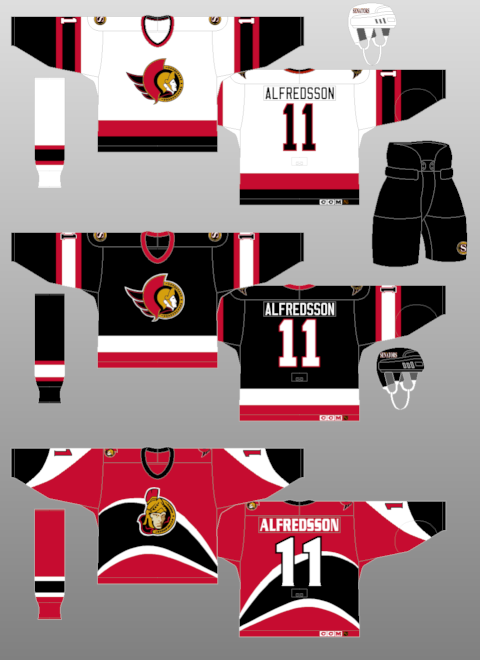
Heritage 1.0 (2011-2017)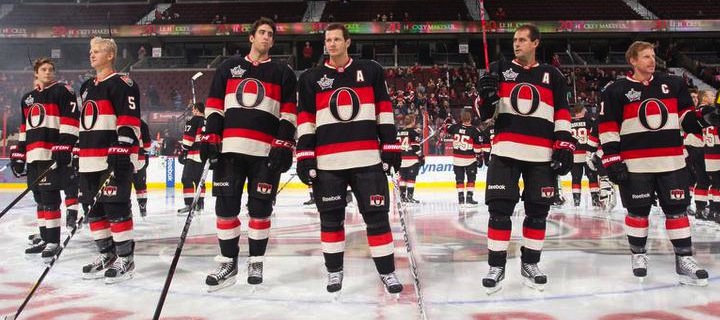 |
| Jersey unveil attendance numbers way down from 2007 |
To celebrate their 20th anniversary, the Sens gave us what is possibly their best jersey of all time. These jerseys made their debut in a 7-1 loss to the Colorado Avalanche (also featuring a Duchene goal, see video above). I generally think about this jersey as being a very recent design but this jersey came out before Kyle Turris was on the team. Filip Kuba was on the team when these were unveiled.
The Sens made a white version of their Heritage jersey prompting frequently explanations of the difference between “Heritage jersey” and “Heritage Classic jersey”. I remember absolutely nothing notable about the actual Heritage Classic but I remember blowing 3 goal leads to the Habs twice in the span of weeks in these jerseys.
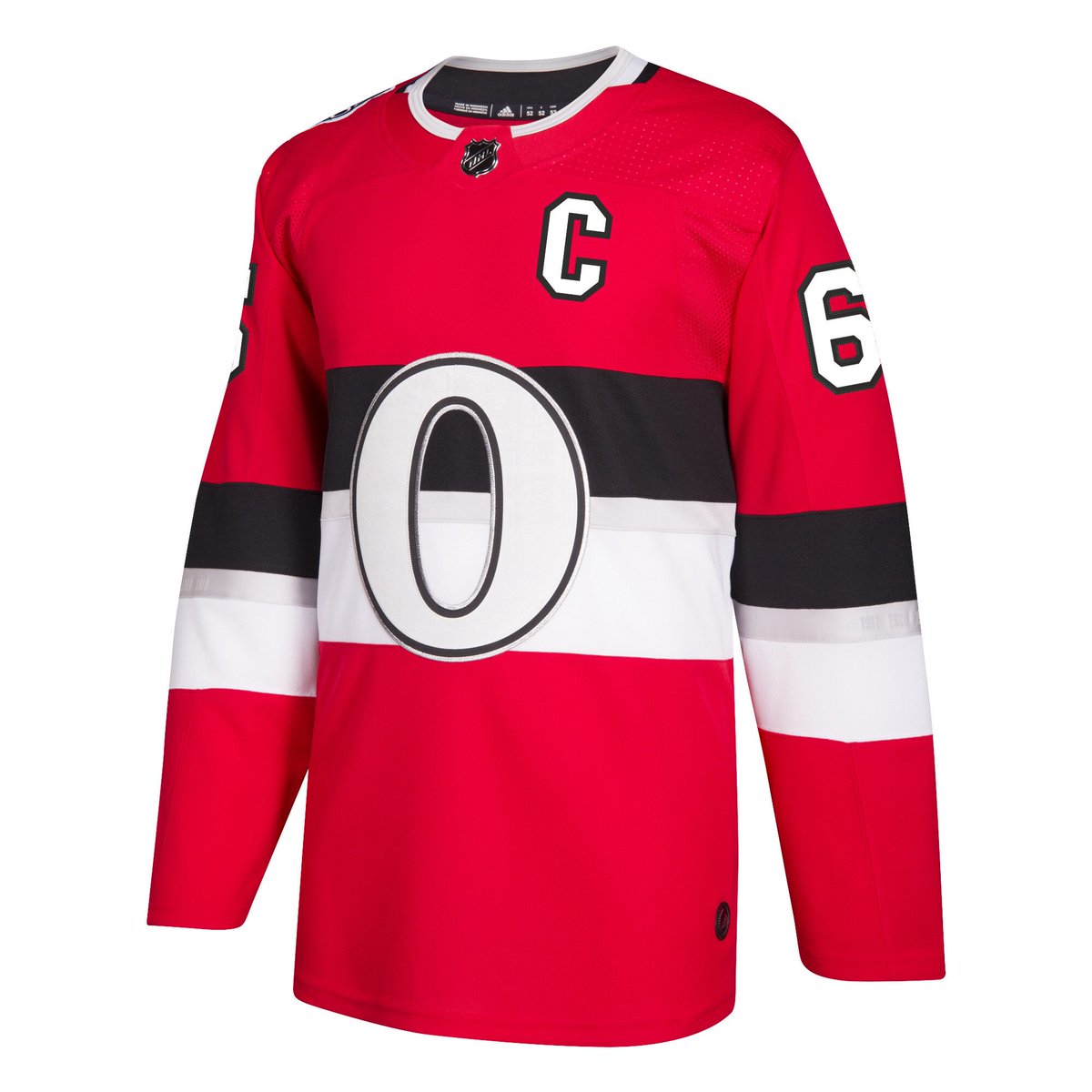
Heritage 3.0/ Post-Heritage (2017)
We’ve now arrived at the post-Heritage era of Senators jerseys. This jersey rejects the traditional elements of what was once a heritage jersey. While this is not necessarily a bad thing, it represents a significant societal shift in what we consider to be heritage. At the height of the gold and laurel leaves, who would have thought that the Senators would one day incorporate silver into their jersey?
Anyways, thanks for reading.


Leave a Comment